
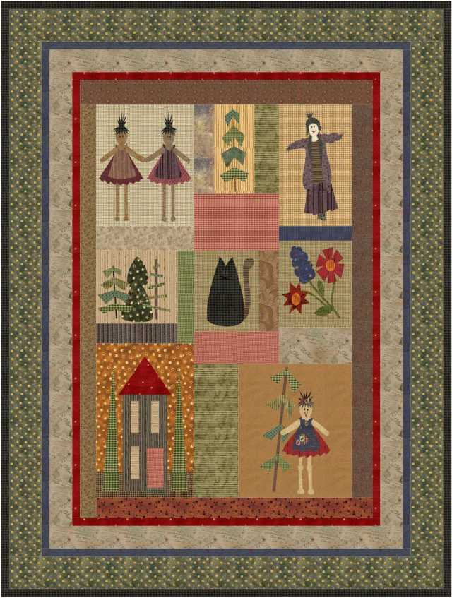
Not so long ago primitive designs and dark, dirty fabrics were very much in fashion.
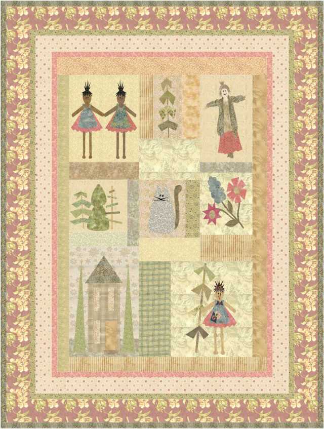
The primitive designs look very different in pretty pastels …
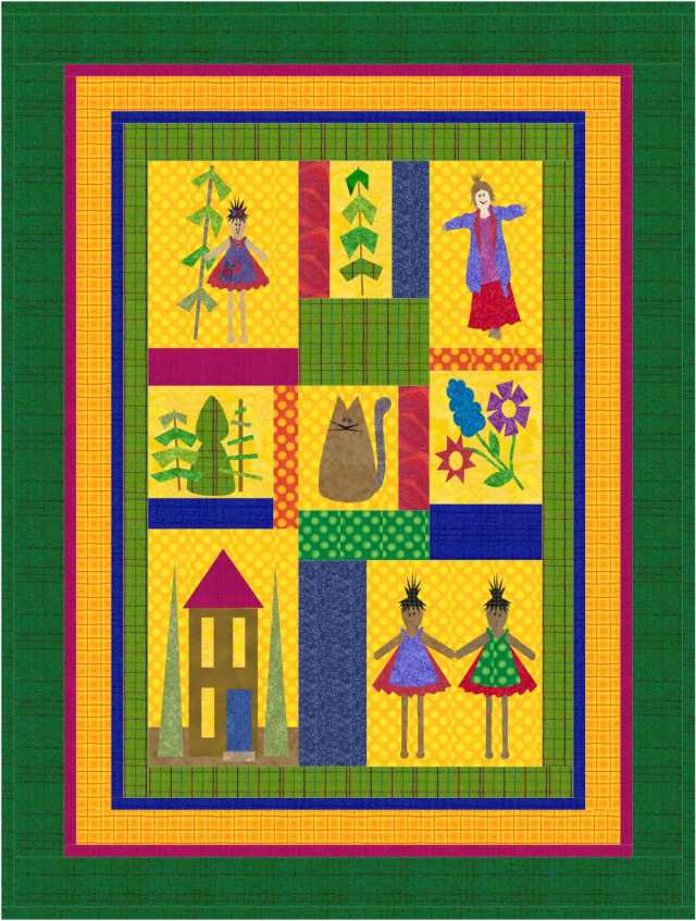
… and different again in very bright colours.
I like the design, and I like all the colour schemes, but if you like a design but not the colours, change the colours!
Suit the colours to the surrounding decor, or to the preferences of the person who the quilt is being made for. Now I am wondering what the design would look like in shades of blue, and would it look best with all bright blues, or pastels, or something in between.


 Quilter Blogs & Store Search


I’m usually a ‘brights’ person, but really like the primitive, dark, and dirty look on your design. Hopefully not a reflection on my character. LOL!
LikeLike
Liz,
Definitely not a reflection of your character … no quilting doll maker could be that dirty, dark and primitive!
Happy new year … and if you would like a little bit of warmth I would love to be able to send you some!
Judy B
LikeLike
Oooooo this could be turned into the rag doll look and rag the seams. I like them all but number 2 would be the one for me! 🙂
LikeLike
Now there is a thought!
I would emphasise the raggy look with scraps … no two pieces alike in the whole quilt!
Judy B
LikeLiked by 1 person
I’m right there with Liz…love the primitive dark and dirty!
LikeLiked by 1 person